CNCBI — Design System
Design entropy at 2M-user scale
Design doesn’t scale easily. Efficiency doesn’t emerge from thin air. Scaling design through hiring — without putting standards in place — is a myth. With every new hire, new ideas for colour palettes, typography and patterns appear in the product, growing the inconsistency and increasing the maintenance cost. Every new hire increases the design entropy.
There’s only one way to stop the growth of the chaos: commit to running a design system process. Gradual growth of a design system equals gradual increase in consistency and speed of software development. A design system is a set of standards for design and code along with components that unify both practices — the same set of instructions and Lego kit for everyone.
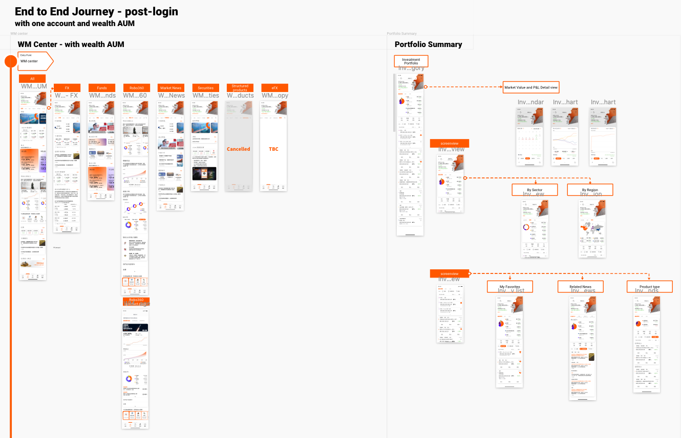
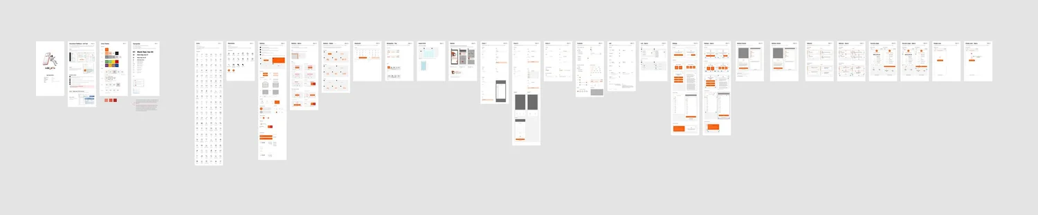
Audit existing components
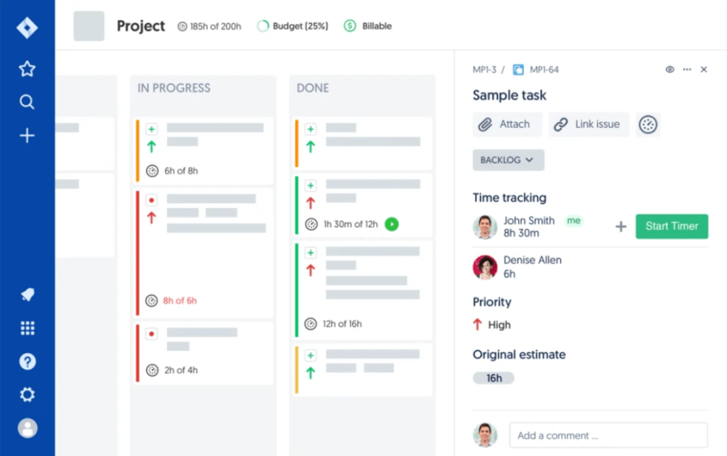
Organised every page by component type, searched for specific pages, filtered by component using the right panel, and surfaced current use cases across all pages. This also exposed where design inconsistencies lived — the starting map for the whole system.
Reference systems & banking UI
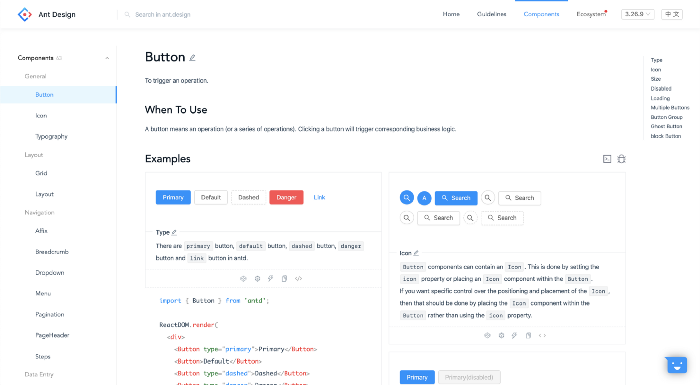
Not all design systems translate to banking. After team discussion we settled on IBM, Ant Design and Bootstrap as references for the structure, and HSBC and MOX as references for banking UI.
Ant Design in particular showed us a great dev-facing UX: components categorised by type (Data Display, Data Input, Navigation…), anchors for on-page navigation, every state showcased upfront, interactive examples, and one-click copy or open-in-sandbox for code. That became our target for our own docs.
Choose the right toolchain with a POC
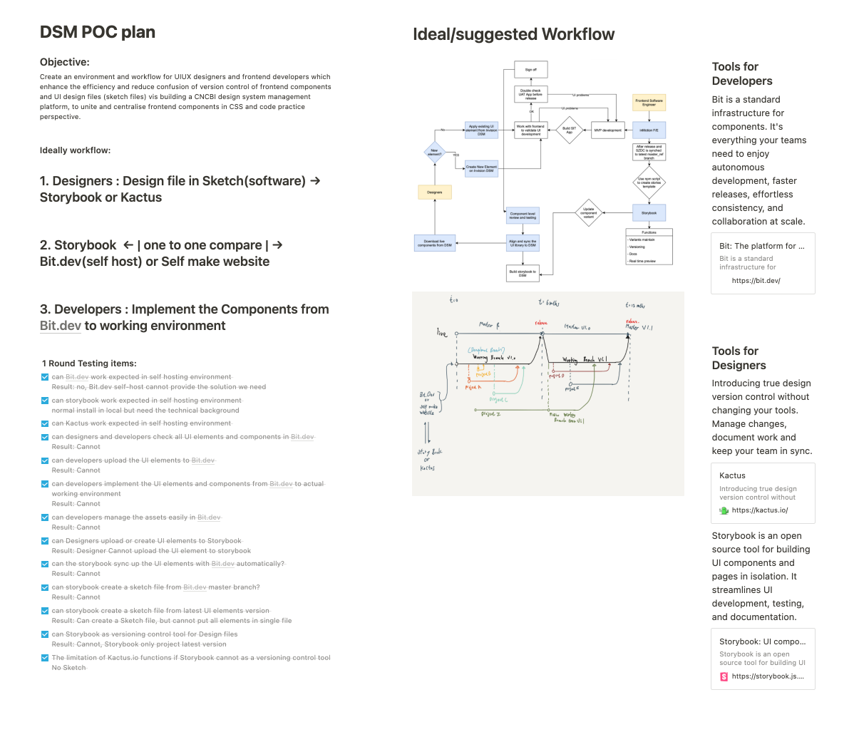
Design-system management was new territory for the company. Before rolling a workflow across the studio, we ran a small POC to learn how a design-system management system would actually fit each team’s current practice — not just the theory.
Workshopping every component
For each component: design its attributes and states, and establish its usage guidelines. We reviewed its Jira use cases and studied industry best practice — reading articles, examining how other teams used the component — and then decided on the canonical form for us. From those decisions the structure of the system emerged.
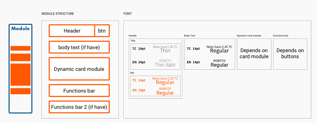
A weekly timeline, foundations first
A weekly schedule based on what needed to be done and who would do it — keeping stakeholders aware of progress and enabling resource allocation. We ordered the backlog by Jira use-case frequency, but prioritised foundations (typography, colour, layout) first, because every subsequent component depends on them.
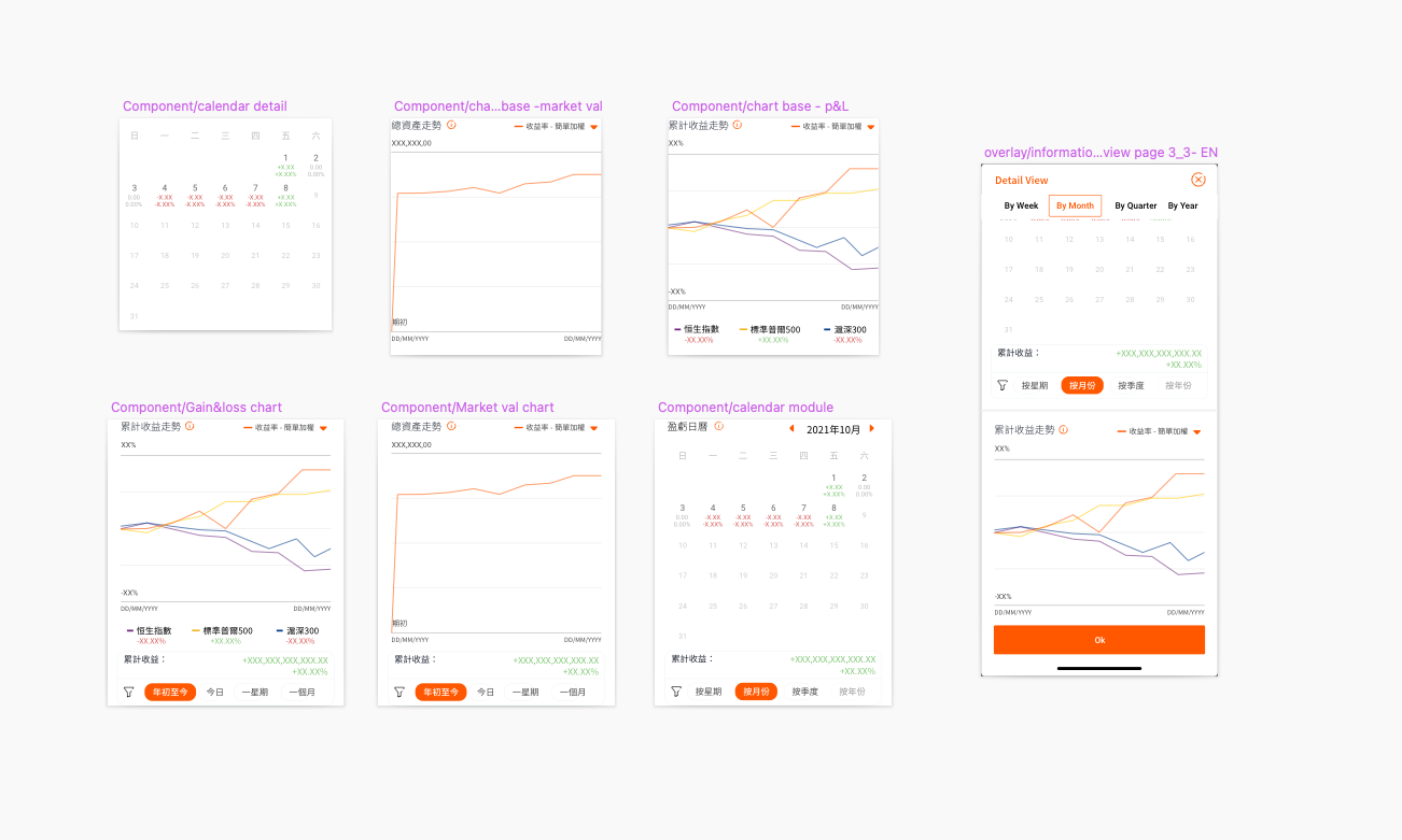
Naming conventions & nested symbols
Combed industry articles and other UI toolkits to compare naming conventions and nested-symbol strategies. Previous experience told us the right model was the one that fit our current workflow — and that as tools evolved we’d adjust the naming accordingly. We treated the naming system as a living contract.
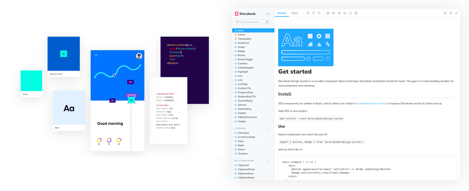
Sketch → Invision DSM → Storybook
Usage guidelines written clearly for each case. Sketch symbols from the styleguide imported directly into Invision DSM via plugin. Storybook hosted the live component examples for frontend developers with interactive snippets. A design-token API kept the rest of the team in sync with design values automatically.
Implement and replace
Communication with engineers, PMs and other stakeholders was the hardest part. Implementation meant building the new components, wiring them to Storybook and Invision DSM, and progressively replacing the legacy components in both the product and the design files — without breaking either surface mid-flight.